
Software
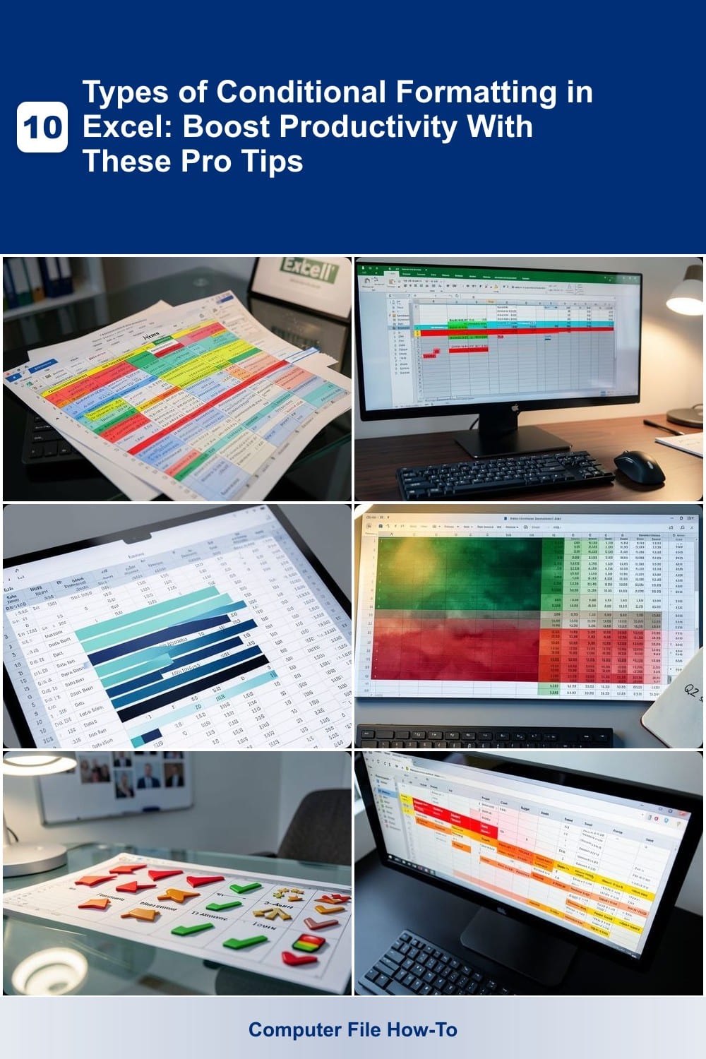
Struggling to make your Excel spreadsheets more intuitive and visually engaging? Conditional formatting transforms raw data into actionable insights instantly. These 10 types of conditional formatting will help you automate analysis, highlight key metrics, and streamline workflows like a pro.
Highlight Cells Rules for Data Validation
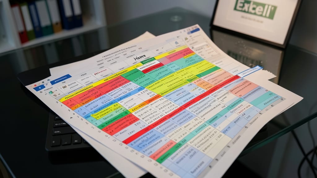
Ever spent hours manually scanning spreadsheets for errors or inconsistencies? Highlight Cells Rules in Excel automates this tedious task with just a few clicks, making it a lifesaver for beginners and pros alike.
This feature lets you define prebuilt rules like "Greater Than", "Text Contains", or "Date Before" to instantly flag cells that meet (or don’t meet) your criteria. For example, highlight red for negative values, yellow for duplicates, or green for valid entries—perfect for financial audits or inventory checks. The best part? You can even customize the fill colors to match your workflow.
Ideal for anyone managing data integrity, this tool cuts review time by 80% while reducing human error. Give it a try on your next dataset—your eyes (and sanity) will thank you. ✨
Top/Bottom Rules for Performance Metrics
Need to spot your top performers—or flag underperformers—in seconds? Top/Bottom Rules in Excel automatically highlights the best and worst values in your dataset, saving hours of manual sorting and analysis. This feature is a game-changer for sales teams, managers, or anyone tracking KPIs.
With just a few clicks, you can set rules like "Top 10%" (green) or "Bottom 5%" (red) to visually rank sales reps, customer satisfaction scores, or inventory turnover. The best part? You can customize the number of items and even adjust thresholds (e.g., "Top 20% by revenue") to align with your goals. No formulas or complex setups required—just pure, visual clarity.
Perfect for quarterly reviews, team incentives, or inventory optimization, this rule turns raw data into instant insights. No more squinting at spreadsheets—let Excel do the heavy lifting. ✨
Data Bars for Comparative Analysis
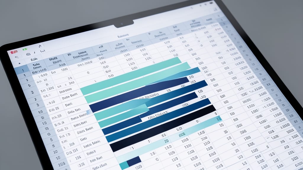
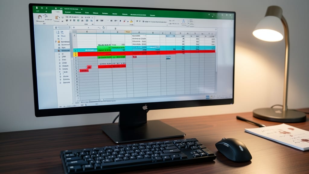
Tired of scanning endless rows of numbers to spot trends? Data Bars turn your Excel cells into instant visual comparisons—no charts or extra sheets required.
These sleek, horizontal bars scale proportionally to cell values, making it effortless to compare budgets, sales figures, or project timelines at a glance. Customize colors, axis direction (left-to-right or top-to-bottom), and even negative values for nuanced insights. Best of all, they adapt dynamically as your data updates.
Perfect for finance teams tracking expenses or marketing analysts comparing campaign performance—no coding or complex setups needed. ⚡
Color Scales for Gradient Visualization
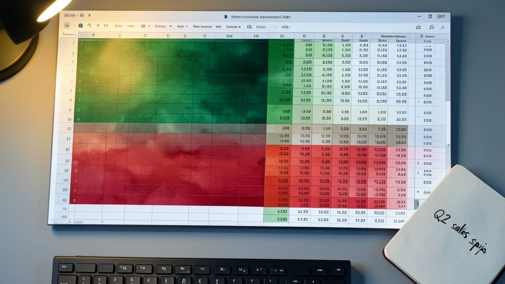
Turn static numbers into a visual story with color scales, where gradients like green-to-red instantly reveal ranges in your data—think heatmaps, temperature trends, or sales performance by region.
Excel’s built-in two-color or three-color scales let you map values to a spectrum (e.g., green for low, red for high) with minimal setup. Customize the minimum/maximum values to fit your dataset, and watch how trends emerge at a glance. Perfect for datasets where exact numbers aren’t as impactful as the pattern—like weather data or inventory levels across locations.
Data analysts and dashboard creators will love this for quick, intuitive insights without cluttering cells with text or icons. Just apply it to your table, and let the colors do the talking. ✨
Icon Sets for Quick Status Updates

Tired of scanning endless text labels in your project tracker? Icon Sets replace words with visual cues—think red flags for delays, green checkmarks for completed tasks, or arrows for priority levels—so your team grasps status instantly.
Excel offers 12 built-in icon sets (like Rating, 3-Arrows, or 5-Ratings) that adapt to your data ranges. For example, assign a red traffic light to overdue tasks or a blue upward arrow to trending metrics. The formatting updates automatically when your data changes, keeping dashboards current without manual edits.
Perfect for project managers, client updates, or agile sprint boards, this method cuts meeting time by letting stakeholders "see" progress at a glance. No more explaining "red means blocked"—just point and understand. ✨
Custom Formulas for Advanced Logic
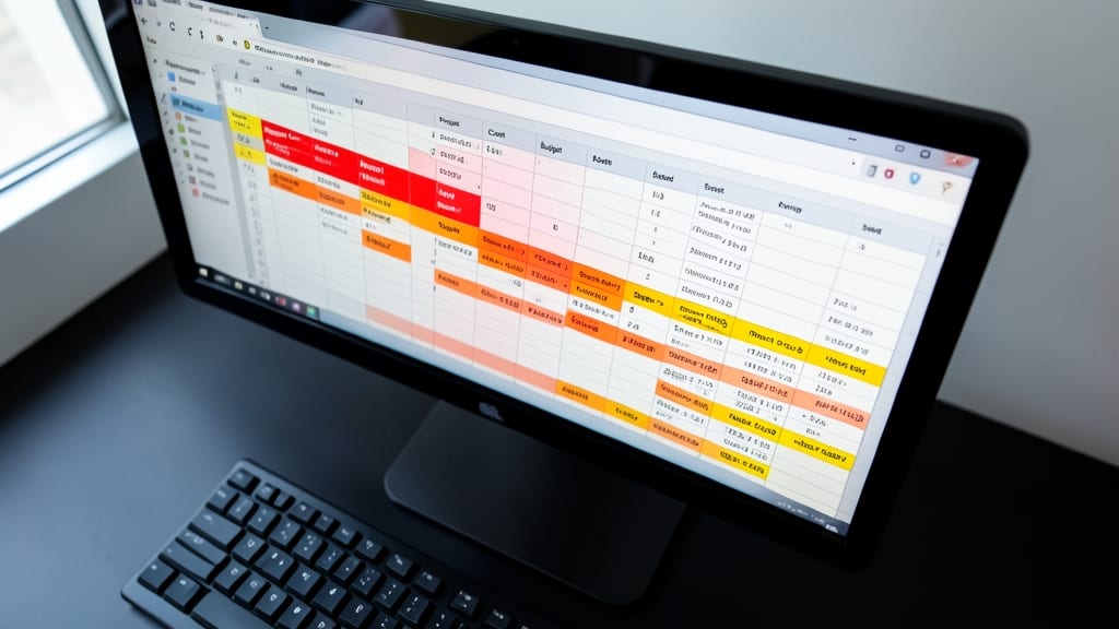
When your data needs more than just simple "greater than" or "contains" rules, custom formulas unlock the full power of Excel’s conditional formatting. This feature lets you build bespoke logic—like highlighting cells where "Project Cost > Budget AND Status = Delayed"—using familiar functions like =IF, =AND, or =OR.
Start by selecting your range, then choose "Use a formula to determine which cells to format" in the conditional formatting menu. Enter your logic (e.g., =AND(B2>1000,C2="Late")) and pick a fill color. The result? Dynamic, rule-based highlights that adapt to your data’s nuances—no manual updates needed. For finance teams, this means instantly spotting budget overruns paired with delays.
Perfect for analysts, project managers, or anyone crunching complex datasets, this tool turns Excel into a real-time alert system for your most critical conditions. ✨
Dynamic Rules with Tables
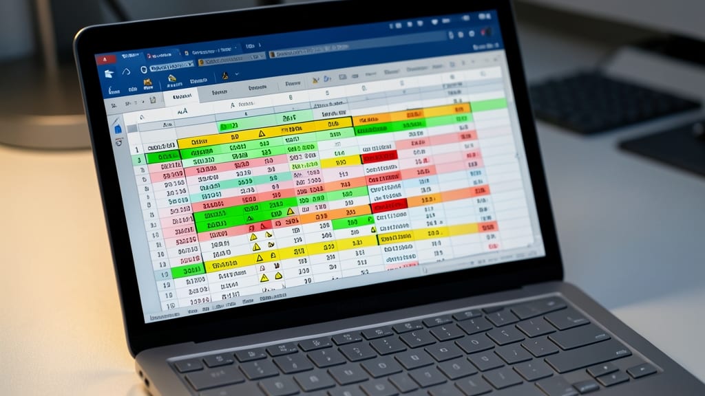
Tired of manually updating conditional formatting every time your dataset grows? Dynamic Rules with Tables in Excel solves that by automatically applying rules to new rows as you add data—no extra clicks required.
Convert your static range into an Excel Table (Ctrl+T), then apply conditional formatting. The magic happens when you add new rows: the formatting expands dynamically, ensuring consistency without manual intervention. Perfect for CRM pipelines, transaction logs, or any dataset where rows change frequently. Simply convert your data to a table, and Excel handles the rest.
This is a game-changer for teams managing live datasets—like sales teams tracking leads or inventory managers monitoring stock levels. No more broken rules when you import fresh data! ✨
Cell Value Rules for Threshold Alerts
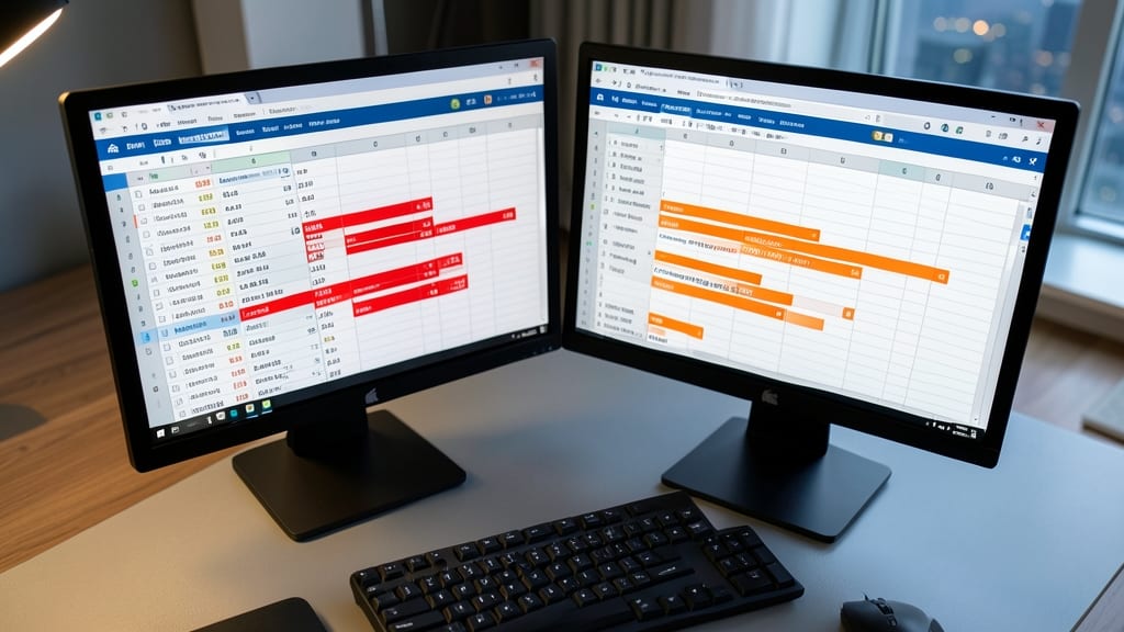
Tired of manually scanning spreadsheets for critical thresholds like low inventory or overspent budgets? Cell Value Rules for Threshold Alerts automates this with precision, letting you set exact values to trigger visual alerts—no more missed deadlines or stockouts.
Configure rules like "Cell Value < 10" to highlight inventory levels in red or "Cell Value > 90%" to flag over-budget expenses in yellow. Works with numeric, date, or text values, and supports custom formatting (fonts, colors, or data bars) for instant visibility. Best of all, it updates in real-time as your data changes.
Finance teams and operations managers will love this for automated risk monitoring, while small business owners can use it to track cash flow or project milestones without constant oversight. ⚡
Sparkline Charts for Micro-Trends

Tired of scrolling through rows of numbers to spot trends? Sparkline charts pack entire mini-trends into single cells—think tiny line graphs for weekly sales or bar charts for daily temperatures—without leaving your spreadsheet.
These micro-charts support line, column, or win/loss styles and update automatically when your data changes. Perfect for dashboards where space is tight, they let you compare metrics like stock prices, project timelines, or sensor readings at a glance. Customize colors, markers, and axes to match your brand or highlight key thresholds.
Ideal for analysts, project managers, or anyone crunching time-series data, sparklines turn static numbers into visual stories—no extra tabs or charts needed. ✨
Manager Rules for Multi-Condition Logic
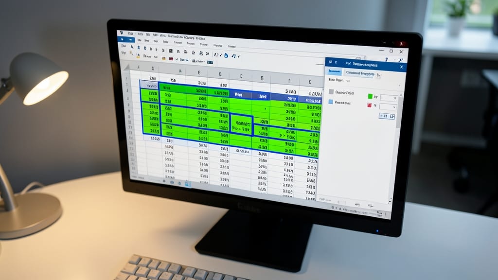
When your data requires more than a single condition—like flagging high sales only in specific regions—Manager Rules in Excel’s conditional formatting are your secret weapon. Unlike basic rules, this feature lets you chain conditions (e.g., "Region = West AND Sales > $10K") to create precise, multi-layered logic without writing custom formulas.
You can combine up to three conditions per rule, using operators like AND, OR, or NOT, and apply formatting based on their results. For example, highlight cells in green if two conditions are met, or yellow if just one applies. This is ideal for analyzing regional performance, tracking multi-factor KPIs, or auditing datasets where multiple variables matter.
Perfect for analysts, sales managers, or anyone juggling complex datasets—this rule type turns Excel into a dynamic dashboard without requiring VBA. ✨